Device & Browser Support

It’s a heterogeneous world – many devices – many browsers – and more in the future…
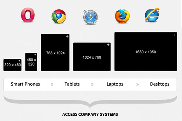
Which is why we use HTML5 fluid-width adaptive technology extensively to provide you with a website compatible with desktop computers, tablets, and mobile smart phones. The Mondrian web sites auto adapt for all screen resolutions, all of the latest browsers, and still look incredibly stunning on every device.
It’s simply your choice what device and what browser you want use to view, edit, collaborate and access your data and information. And if you want to change device or browser at any time, no problem – you will not be “locked in” to history and will be able to choose any brand in the future you prefer.
Modern web design needs to be adaptive for size and orientation and also cater for mobility
People no longer just browse the web with desktop computers. People now use multiple products; mobile phones, PCs, Apple Macs, notebooks, ultrabooks, tablets (Apple iPad, Android and Windows devices), at various different times to access the web.
Almost every user these days wants mobile access to the web when they’re not at their desk so modern web layout also needs to automatically adjust to fit all display resolutions and devices to allow users the same pixel-perfect, “full functionality” experience on every device. By using HTML5/CSS3 and other responsive technologies, websites can become fluid and can easily adapt to the width of the browser when combined with clever design techniques.
The code for this website auto-adapts and reformats the layout to fill whatever screen space is available from small mobile phone screen sizes to massive displays, covering screen resolutions from 320px (1st generation iPhones) to 2560px (large monitors) or even higher. And is all defined by one URL, one version, and one set of source code.
For many websites, creating a website version for each resolution and new device would be impossible, or at least impractical; and in the next five years, we’re likely to see a large number of additional future inventions. We’re pretty confident that you will be able to use these new devices with this website – straight out of the box!
Device and Browser Support
We test our software on as many devices and as many browsers as we can, but we do not advocate use of any versions of browsers older than a few years as they just do not have the capability and will unfortunately never be upgraded to support the latest HTML5 technology standards – the standards as defined by the World Wide Web Consortium (W3C).
So as long as you pick a device that supports a browser that has adequate support for the HTML5 standards, our software will work flawlessly.
Check out the “other browsers” tab on http://www.html5test.com to see what browsers provide the best HTML5 support.
Our recommendation is make sure that you pick a modern browser from the HTML5test.com site that has a test score greater than 200. This means our minimum version preference for modern browsers is Chrome 6, Firefox 8, Safari 5.1, and Opera 11.50.
We have never seen any issues or incompatibilities with the latest Smart Phones or Tablets as they normally have modern browsers. Older PC systems and early generation Apple Macs need to be treated more carefully, but should exhibit no issues if running the minimum version preferences detailed above.
PCs running Microsoft Internet Explorer version 9 (IE9) provide the absolute minimum HTML5 capability to run this site. IE9 was originally released in March 2011 and is still a Microsoft supported product. Older versions than IE9 have insufficient support for the standards and it’s unlikely they will ever be upgraded so should be avoided.
